The page builder
Easy Eatery's page builder makes it possible to quickly and easily create media-rich pages on your website, using page layouts consisting of content blocks.
Content blocks are modular, pre-designed layout elements that can be added to a page and populated with your own text, images and other media.
Easy Eatery currently offers 25 content blocks as standard, and developers can use our block builder to extend the page builder with custom blocks.
Page layouts can consist of any number of content blocks, displayed in any order.
This block-based approach takes the design pressure off you and drastically simplifies the process of creating and maintaining pages on your website.
While it may appear daunting at first glance, we've designed our page builder to be easy to use, so you'll quickly learn the basics and be a natural in no time.
Our page builder, at a glance.
In the following screenshot you'll see our page builder integrated within the pages section of the My Easy Eatery control panel.
However, you will also find the page builder within the food and drink section; whilst editing menus. Other integrations will follow as more features come online.
In this screenshot, the page builder begins under the two tabs: 'Page design' and 'SEO & settings':

The toolbar:
The first element within the page builder is the toolbar. This is a floating design element which follows you down the page as you scroll. Within it you'll find five key elements:
| Element | Description |
|---|---|
| The 'block counter' | The block counter shows how many blocks you currently have added within a page layout. In the above example, there are '6 blocks on this page'. |
| The 'version history' button | Clicking the 'version history' button will open up the page revisions menu, which allows you to view and publish older versions of the current page. |
| The 'Expand all' button | The 'Expand all' button will maximise, or show all hidden content blocks added to the page. |
| The 'Collapse all' button | The 'Collapse all' button will collapse, or hide all of the visible content blocks added to the page. |
| The 'Add new' button | The square orange button with the plus icon inside opens the 'Add a new block' popup which lets you add new blocks to the page. |
Under the toolbar you'll find the content blocks.
All blocks added to the page you are editing will be shown in a list under the toolbar. The ordering of blocks within this list is important.
Blocks will appear on your website in the same order you arrange them in within the page builder, with blocks at the top of the page builder appearing first on your page.
All blocks use a highly-standardised design and layout, in order to make them easy to manage. Here's an example of a block, our 'Large call to action':

All content blocks consist of two key components:
The block header
This is the dark grey box that spans the full-width of the page builder at the top of each block.
The block header contains several controls for the block it belongs to. From left to right they are:

The handle:
Reorder blocks using the handle. To do this, click and drag the selected block up or down the page via the handle. Simply release the mouse button when you're ready to drop the block in it's new position on the page.

The 'move up' button:
The second button, represented by the double-arrow pointing up will move the selected block above the previous block in the page order.

The 'move down' button:
The third button, represented by the double-arrow pointing down will move the selected block below the next block in the page order.

The block title:
The teal and white text inside the block header form the block title. Blocks are numbered based on their order on the page. The white text is the name of the content block itself.

The delete button:
The semi-transparent red trash can icon on the right side of the block header will remove the selected block from the page. If you click this button you'll be asked to confirm if you want to remove the selected block.

The toggle button:
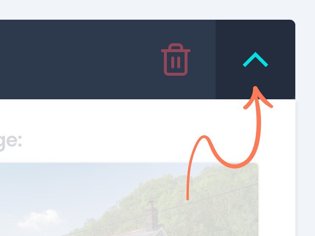
The toggle button expands or collapses a block — shows or hides its fields — depending on the block's current state. If you collapse a block, the fields within that block will be hidden but the block header will remain visible. Clicking the toggle button again will show the fields once more.